When preparing a home for the market, many sellers focus on staging interiors, updating fixtures, and landscaping. Yet one decision often overlooked carries outsized weight in shaping first impressions: the exterior paint color. The hue wrapping your home's façade doesn't just define its curb appeal—it can actively influence how quickly a property sells and at what price point.
Real estate professionals have long understood that color psychology extends beyond living rooms and bedrooms. The shade greeting potential buyers as they pull up to a showing or scroll through online listings sets an emotional tone before the front door ever opens. A well-chosen exterior palette signals care, quality, and timelessness. A jarring or overly idiosyncratic choice, by contrast, can prompt hesitation or even prompt buyers to scroll past entirely.
The challenge lies in balancing personal taste with marketability. While a bold statement color might express individuality, it can also narrow the pool of interested buyers. Strategic neutrals and nature-inspired tones, however, tend to photograph well, complement diverse architectural styles, and allow prospective purchasers to envision their own lives unfolding within the walls.
Warm Whites Anchor Classic Appeal
Few exterior finishes deliver the universal appeal of a warm white. Unlike stark, cool whites that can read as sterile or institutional, warm whites carry subtle undertones—hints of cream, beige, or even the faintest whisper of pink—that soften the overall effect. This category of paint has dominated high-end real estate listings for years, and its popularity shows no sign of waning.
The key to success with warm whites lies in calibration. Too much yellow can veer into dated territory, while overly cool tones risk appearing harsh in certain lighting conditions. Testing samples on multiple exterior walls and observing them at different times of day helps ensure the chosen shade reads as intended. Warm whites excel on traditional colonial homes, transitional builds, and even modernist structures where clean lines benefit from a neutral backdrop.
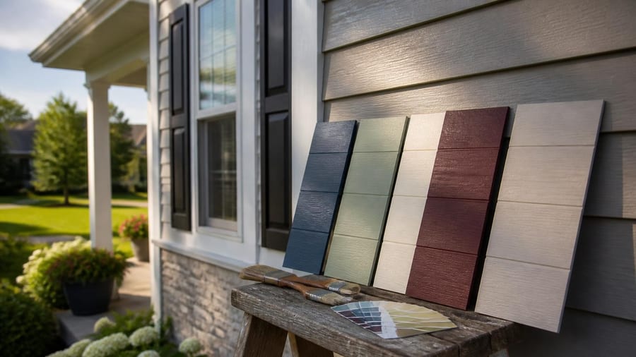
Greige and Taupe Offer Sophisticated Neutrality
Gray once dominated the neutral paint conversation, both inside and out. But the tide has shifted. Many design professionals now caution against cool grays on exteriors, noting that they can feel cold, uninviting, or even cheap depending on the finish and surrounding landscape. The solution? Greige and taupe—hybrid shades that marry the sophistication of gray with the warmth of beige.
These colors provide enough presence to define architectural details without overwhelming the eye. They photograph exceptionally well, translating cleanly in both natural daylight and the often-compressed digital images used in online listings. For homes clad in mixed materials—stone foundations, wood siding, metal roofing—greige tones create visual cohesion without competing for attention.
- Warm undertones prevent the coldness common in pure grays
- Neutral enough to appeal across demographic groups
- Versatile pairing with both natural wood and modern materials
- Strong performance in real estate photography
Earth Tones Echo Natural Surroundings
A growing segment of buyers gravitates toward homes that feel integrated with their environment rather than imposed upon it. This preference has fueled renewed interest in earth-inspired palettes: sand, stone, terracotta, ochre, and sun-baked clay. These shades carry a quiet elegance, particularly on homes featuring natural materials like brick, timber, or stucco.
Earth tones work especially well in regions where the landscape itself offers chromatic cues. A pale terracotta might harmonize beautifully with the desert Southwest, while a soft sandstone beige complements coastal or prairie settings. The psychological effect is subtle but powerful: the home feels rooted, established, and thoughtfully considered. Buyers often interpret this as evidence of quality and care extending beyond mere aesthetics.
When a home's exterior palette mirrors its surroundings, it creates a sense of belonging that resonates emotionally with buyers seeking harmony between architecture and environment.
Historic Hues for Timeless Architecture
Certain architectural styles practically demand period-appropriate color schemes. Federal-style homes, Victorian painted ladies, and craftsman bungalows each carry historical color traditions that, when honored, enhance authenticity and appeal. Deep greens, muted reds, classic navy, and heritage yellows fall into this category.
While these shades might seem bold compared to contemporary neutrals, they serve a strategic purpose: they signal respect for the home's architectural lineage. Buyers drawn to historic properties often appreciate details that preserve character rather than erase it. A well-executed historic palette can differentiate a listing in a competitive market, attracting buyers willing to pay a premium for authenticity.
The caveat? Color accuracy matters. A shade that skews too bright or saturated risks looking cartoonish rather than classic. Researching the specific architectural period and consulting historical paint references ensures the result feels genuine rather than costume-like.
Strategic Black and Charcoal for Modern Edge
Black and deep charcoal exteriors have surged in popularity, particularly in urban and contemporary settings. When executed thoughtfully, these dramatic hues convey sophistication, confidence, and modernity. They also provide striking contrast for white trim, metal accents, and natural wood elements.
However, this choice carries risk. Dark exteriors can feel oppressive on smaller homes, absorb heat in warm climates, and show dust, pollen, and weathering more readily than lighter shades. They also tend to polarize buyers: those who love the look are often willing to pay a premium, while those who don't may dismiss the property outright.
| Color Family | Best Application | Buyer Appeal |
|---|---|---|
| Warm Whites | Traditional, transitional | Broad, universal |
| Greige/Taupe | Mixed materials, modern | High, sophisticated |
| Earth Tones | Natural settings, stucco | Regional, eco-conscious |
| Historic Hues | Period architecture | Niche, premium |
| Black/Charcoal | Contemporary, urban | Polarizing, bold |
Colors to Avoid for Maximum Resale Potential
While strategic color choices can enhance value, certain hues actively undermine marketability. Bright, saturated colors—vivid oranges, electric blues, hot pinks—limit buyer imagination and often require immediate repainting. Similarly, trendy shades that feel au courant today may look dated within a few years, signaling to buyers that other updates might also be needed.
Overly cool grays, as noted earlier, can read as builder-grade or cheap. Pure white without warm undertones often appears stark and unwelcoming. And colors that clash with fixed elements—roofing, brick, stone—create visual discord that buyers interpret as poor judgment or lack of attention to detail.
This information does not replace advice from a qualified real estate professional or color consultant. Individual results may vary based on local market conditions, architectural style, and regional preferences.