When summer fashion conversations emerge, the color wheel typically spins toward two predictable camps: soft pastels that whisper spring romance or electric brights that shout poolside confidence. Yet television presenter Alex Jones recently stepped out in a dress that belongs to neither category, proving that the most compelling seasonal style often lives in the overlooked middle ground.
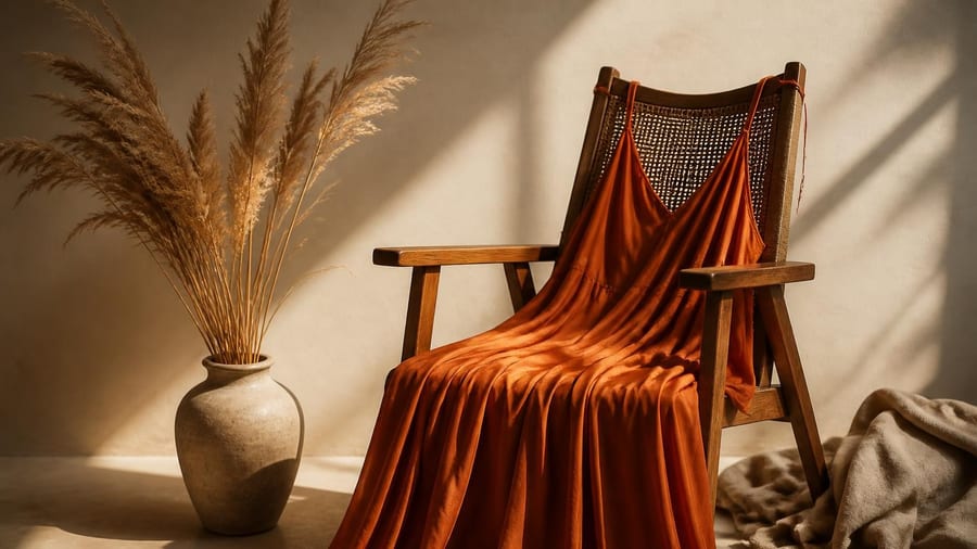
Her choice—a dark, zesty orange that fashion insiders are calling burnt sienna or terracotta—has sparked a broader conversation about how Americans approach warm-weather color. The shade sits comfortably between aggressive neon and timid blush, offering visual impact without the commitment anxiety that often accompanies bold wardrobe decisions.
The Psychology Behind Mid-Tone Color Choices
Color psychology research consistently shows that mid-range hues—those neither pale nor saturated—occupy a unique space in human perception. They register as confident without aggression, noticeable without demanding constant attention. Burnt orange and terracotta tones specifically carry associations with earthiness and warmth that translate across cultural contexts.
According to studies on color preference and seasonal dressing, consumers gravitate toward lighter tones in summer partly due to practical heat-reflection considerations and partly due to decades of marketing that positioned pastels as the default warm-weather palette. This conditioning overlooks an entire spectrum of sophisticated options that perform equally well under summer sun while offering greater versatility in styling.
Mid-tone warm colors like burnt sienna create visual warmth without the temperature association of darker shades, making them ideal transitional pieces for unpredictable summer weather.
Why Dark Orange Works When Neon Fails
The distinction between Jones's dress color and typical summer brights lies in saturation and depth. While neon orange demands attention through chemical brightness, burnt orange commands it through richness and complexity. The difference matters beyond aesthetics—it affects wearability across different settings and occasions.
Fashion merchandising data reveals that consumers often purchase bright statement pieces but wear them infrequently due to styling challenges. Mid-tone alternatives solve this problem by:
- Pairing easily with neutral accessories without creating stark contrast
- Photographing well in varied lighting conditions, from office fluorescents to golden-hour sunlight
- Transitioning seamlessly from day to evening without requiring a complete wardrobe change
- Complementing a wider range of skin tones than either pastels or neons
Building a Sophisticated Summer Color Strategy
Integrating elegant mid-tones into a summer wardrobe requires a shift in thinking about seasonal color rules. Rather than categorizing shades by temperature alone, consider intensity and versatility as primary selection criteria.
| Color Category | Best For | Styling Challenge |
|---|---|---|
| Pastels (mint, lavender, blush) | Feminine aesthetics, garden parties | Can appear washed-out in harsh sunlight |
| Brights (neon, saturated primaries) | Athletic wear, statement moments | Limited outfit repetition, difficult to accessorize |
| Mid-tones (terracotta, sage, slate) | Professional settings, versatile day-to-night | Requires confidence to break seasonal conventions |
The key to making darker summer colors work lies in fabric choice and silhouette. Breathable materials like linen, cotton poplin, and lightweight crepe prevent the visual weight of deeper colors from translating to physical discomfort. Looser silhouettes with strategic tailoring maintain polish while allowing airflow.
Accessorizing Rich Summer Tones
One reason mid-tone colors feel more elegant than their pastel or neon counterparts is their accessory flexibility. A burnt-orange dress accepts gold jewelry, brown leather, cream canvas, and even unexpected metallics like brushed copper without clashing.
Consider these evidence-based pairing strategies:
- Metallics: Warm golds and coppers echo the undertones in terracotta and burnt sienna, creating visual harmony
- Neutrals: Cream, camel, and chocolate brown provide grounding without competing for attention
- Contrasts: Navy and forest green offer sophisticated opposition that feels intentional rather than jarring
- Textures: Woven materials, raffia, and natural fibers complement the earthiness of mid-tone oranges
The versatility extends to footwear, where everything from white sneakers to tan sandals to cognac loafers works seamlessly. This adaptability makes investment in quality mid-tone pieces more economically sensible than trend-chasing bright colors with limited shelf life.
The Cultural Shift Toward Nuanced Color
Jones's dress choice reflects a broader movement in American fashion toward what industry analysts call "quiet confidence"—styling that makes an impact through considered choices rather than volume. This shift appears in multiple categories, from the rising popularity of earth-tone athleisure to the return of vintage-inspired color palettes in home decor.
Retail data shows increased consumer interest in colors described as "muted," "dusty," or "vintage" across apparel categories. This preference aligns with sustainability conversations, as more nuanced colors typically age better and remain wearable across multiple seasons, reducing the pressure for constant replacement.
Long-Term Wardrobe Investment
From a practical standpoint, mid-tone pieces offer superior cost-per-wear value. A well-constructed dress in burnt orange or terracotta works for:
- Summer weddings and garden parties
- Professional settings when paired with structured blazers
- Casual weekend outings with denim jackets or cardigans
- Early fall transitions without seasonal wardrobe overhaul
This versatility matters particularly for conscious consumers building capsule wardrobes designed for longevity rather than trend cycling. Color choices that transcend seasonal marketing reduce both financial and environmental costs associated with fashion consumption.
Practical Considerations for Dark Summer Colors
While aesthetics drive initial color selection, practical factors determine whether pieces become wardrobe staples or closet orphans. Dark and mid-tone summer colors require attention to fabric technology and care.
Modern textile treatments allow darker colors to perform well in heat through moisture-wicking properties and UV-reflective finishes that weren't available in previous decades. When shopping for rich-toned summer pieces, look for performance fabrics that combine traditional natural fibers with technical enhancements.
Care instructions also matter—colors in the orange family can fade with repeated washing and sun exposure. Following garment care labels and storing pieces away from direct sunlight preserves color integrity across multiple seasons, protecting your investment.
This article discusses fashion and color theory for informational purposes. Individual style choices should reflect personal preferences and practical needs.